
Datavisualization Specalization Course: Visualizing Sustainability
Datavisualization Specalization Course:Visualizing Sustainability
Project partner

The Project
Seven years of successful cooperation between business environment, students, researchers and lecturers and seven years of creativity, inspiration and education visualised. Together with our partners from APG and Waterschapsbedrijf Limburg we developed innovative datavisualization methods and technologies within this 7th edition of our minor datavisualization.
24 students from different faculties from Zuyd Hogeschool | Zuyd University of Applied Sciences realised more than 20 (!!) approaches that push the boundaries of the current used approaches.
Thanks to the ambitious and smart colleagues Erik Sleijpen, Vincent Sijben, Ellen Pijpers en Roel Bindels for all the effort they put in this project.
Also thanks to the students for contributing such exceptional projects – we got very enthusiastic feedback from our partners about the quality. Furthermore we are honoured to see some of you back in the lab in the thesis period


.

Hololens: Visualization beyound two dimensional displays
Hololens:
Visualization beyound two dimensional displays
Project partner

The Project
Together with our partners from the finance sector, Techruption, and the campus, we have developed and evaluated several novel visualization approaches to help portfolio managers oversee assets while more efficiently considering carbon emissions. Our study systematically investigates the differences in user perception between a regular monitor and a mixed reality device.
We conducted a real-life, within-subject experiment in the field with twenty-eight investment bankers, assessing both subjective and objective task performance across two-dimensional and three-dimensional systems. The experiment tested accuracy with regard to position, size, and color using both single and combined tasks.
Interestingly, our results did not show a significant difference in accuracy between mixed-reality and standard 2D monitor visualizations. This finding has important implications for the development of financial visualization tools, suggesting that the choice between 2D and mixed reality interfaces should be driven by factors beyond mere accuracy, such as user preference, implementation costs, and specific use case requirements.


ST. PETERSBURG: UX and UI Design of Data Driven Services
Visiting Professorship in St. Petersburg
UX and UI Design of Data Driven Services
Project partner

The Project
We have developed an innovative new course for the master's program titled "User Experience and User Interface Design of Data-Driven Systems." This curriculum bridges the critical gap between UI/UX design principles, mixed research methodologies, and information visualization techniques.
The course represents a holistic approach to designing interfaces for complex data systems, emphasizing both aesthetic appeal and functional effectiveness. Students learn to create visual systems that not only present data clearly but also provide intuitive, engaging user experiences that facilitate deeper understanding.
We are proud to announce that this groundbreaking course will make its debut at the prestigious Polytechnical University in St. Petersburg. This international launch underscores the global relevance of these interdisciplinary skills in our increasingly data-driven world.

DATAVISUALIZATION: A History Of Terror in the course of time
Data Driven Storytelling:A History Of Terror in the course of time
Project partner
The Project
Global terrorism has been a prominent news topic for several decades. It's a complex issue stemming from various extremist ideologies. What headlines often fail to mention is that attacks, fatalities, and non-lethal terrorism victims have actually been decreasing since 2014. What caused this decline? How significant is the threat today, and what risks remain?
Our analysis examines the three major waves of terrorist activity recorded since the Global Terrorism Database began collecting data in 1970. We identify the groups responsible for the most attacks and document the deadliest incidents to date.
Through our interactive globe tool, users can explore terrorist attacks geographically, filter by attack types, discover the weapons used, view different time periods, and even examine specific terror groups, enabling everyone to explore the complex world of terrorism data for themselves and develop a more nuanced understanding of this global phenomenon.


.

WEARABLES: Information visualization with Instructed Reality
WEARABLES: Information visualization with Instructed Reality
Project partner

The Project
The Human Data Interaction Lab has launched an exciting research collaboration with the Dutch Police and the Open University. In partnership with ILab—an innovation department of the Dutch police—we are initiating two challenging projects to explore novel approaches to human data interaction.
We have already begun the first experiment, which involves mixed teams of domain experts, researchers, and students from Zuyd ICT. This initial project focuses on the development and scientific evaluation of instructed reality technology. This emerging field combines elements of augmented reality with guided interaction systems to enhance decision-making in complex scenarios.
The collaboration represents a significant opportunity to bridge academic research with practical law enforcement applications, potentially transforming how police officers interact with data in the field. By bringing together diverse expertise from multiple institutions, we aim to create innovative solutions that address real-world challenges in public safety and security through advanced data interaction methods.


Dataviz specialization course back on the Campus
Dataviz Specialization Course back on the Campus
Project partner

The Project
Finally, we can bring everything together! Our Data Visualization specialization program is gaining significant traction within our university of applied sciences. This semester, we received so many student enrollments that we're considering launching a second parallel course in the future.
We've attracted students from diverse faculties and study programs, including visual communication, communication and multimedia design, software development, and business intelligence—all eager to join us on this educational journey.
This iteration of the program features an impressive lineup of guest contributors from RWTH Aachen University (Human-Algorithm Interaction), Department of Knowledge Engineering – Maastricht University, Lark Info Lab (Alteryx workshop), APG, Province of Limburg, The Research Centre of Data Intelligence, and the Human Data Interaction Lab.
In the coming weeks, students will work on real-world cases from various organizations: APG (Sentiment Analysis), WBL (IoT Sensor Data), and Open Data from the Province of Limburg, CBS, and Etil.
For the first time, we've integrated Visual Design and Web Technologies as a specialized skills track to support our heterogeneous target group. We've also implemented innovative pedagogical approaches, including problem-based learning, blended learning, flipped classroom methodologies, and other contemporary teaching strategies.
The program's growing popularity reflects the increasing recognition of data visualization as a critical skill across multiple disciplines and industries.


The Flemish Minister for Culture, Youth and Media visits us
The Flemish Minister for Culture, Youth and Media visits us
Project partner
The Project
Sven Gatz, the Flemish Minister for Culture, Youth, Media and Brussels in the Bourgeois Government, recently visited the Brightlands Smart Services Campus. During this significant visit, Kay Schröder had the opportunity to present the work of the Human Data Interaction Lab to Minister Gatz and numerous other political representatives from both the Belgian and Dutch governments.
Our presentation showcased the lab's comprehensive research agenda along with several ongoing projects in cutting-edge fields. We highlighted our work in sustainable finance, big data statistics, and data-driven decision-making initiatives. Among the featured projects were Carbon[X]plore, which focuses on visualizing and analyzing carbon footprints across various sectors, and the Maritime Trade Flows project, which provides insights into global shipping patterns and their economic implications.
The ministerial delegation expressed particular interest in how our visualization approaches can make complex data more accessible to policymakers, potentially strengthening cross-border collaboration on sustainability and economic development initiatives between Flanders and the Netherlands.


Design in Practice: Poster Session Data Driven Design
Data Driven Design in practice
Poster Exhibition on the Brightlands Smart Services Campus
Project partner

The Project
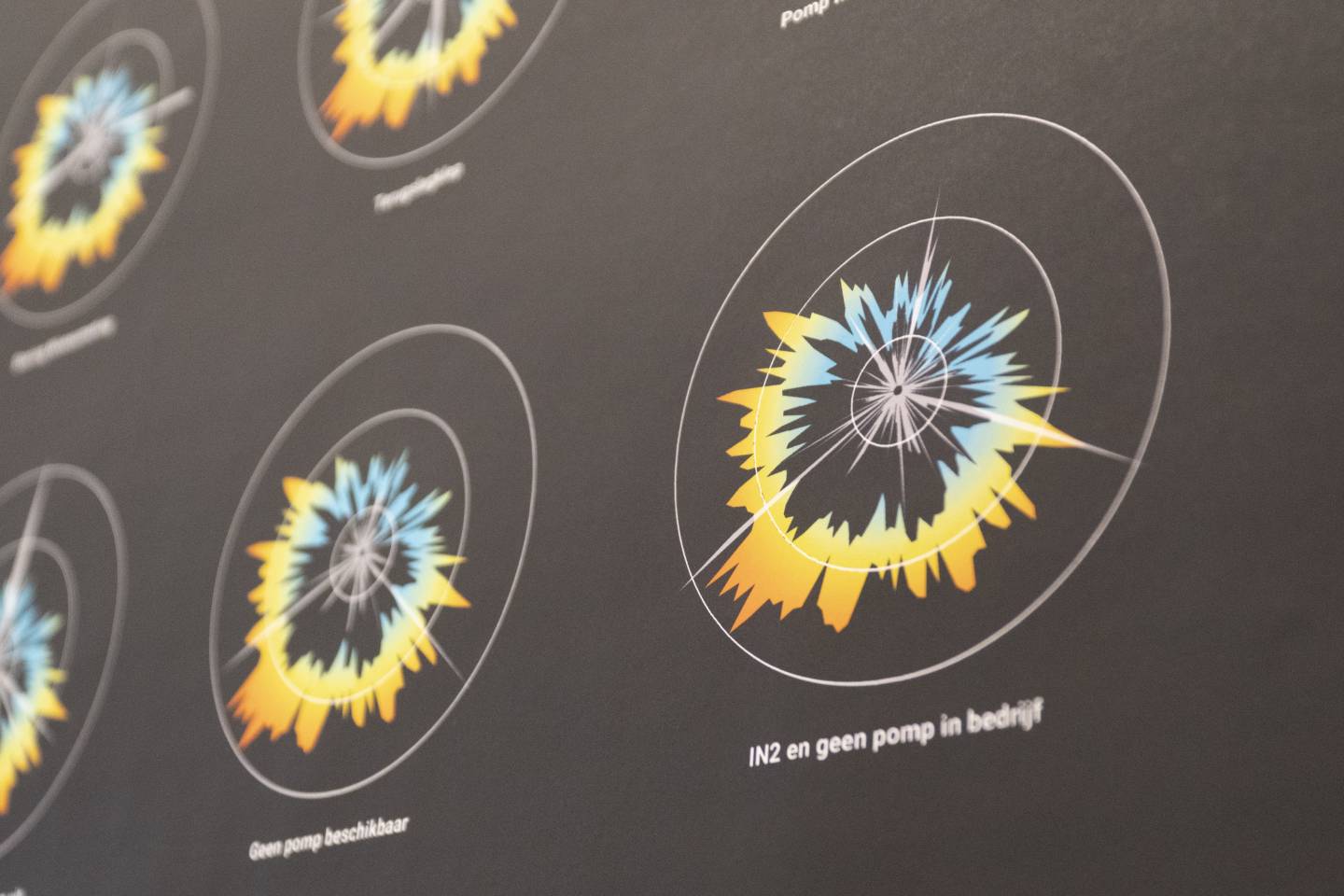
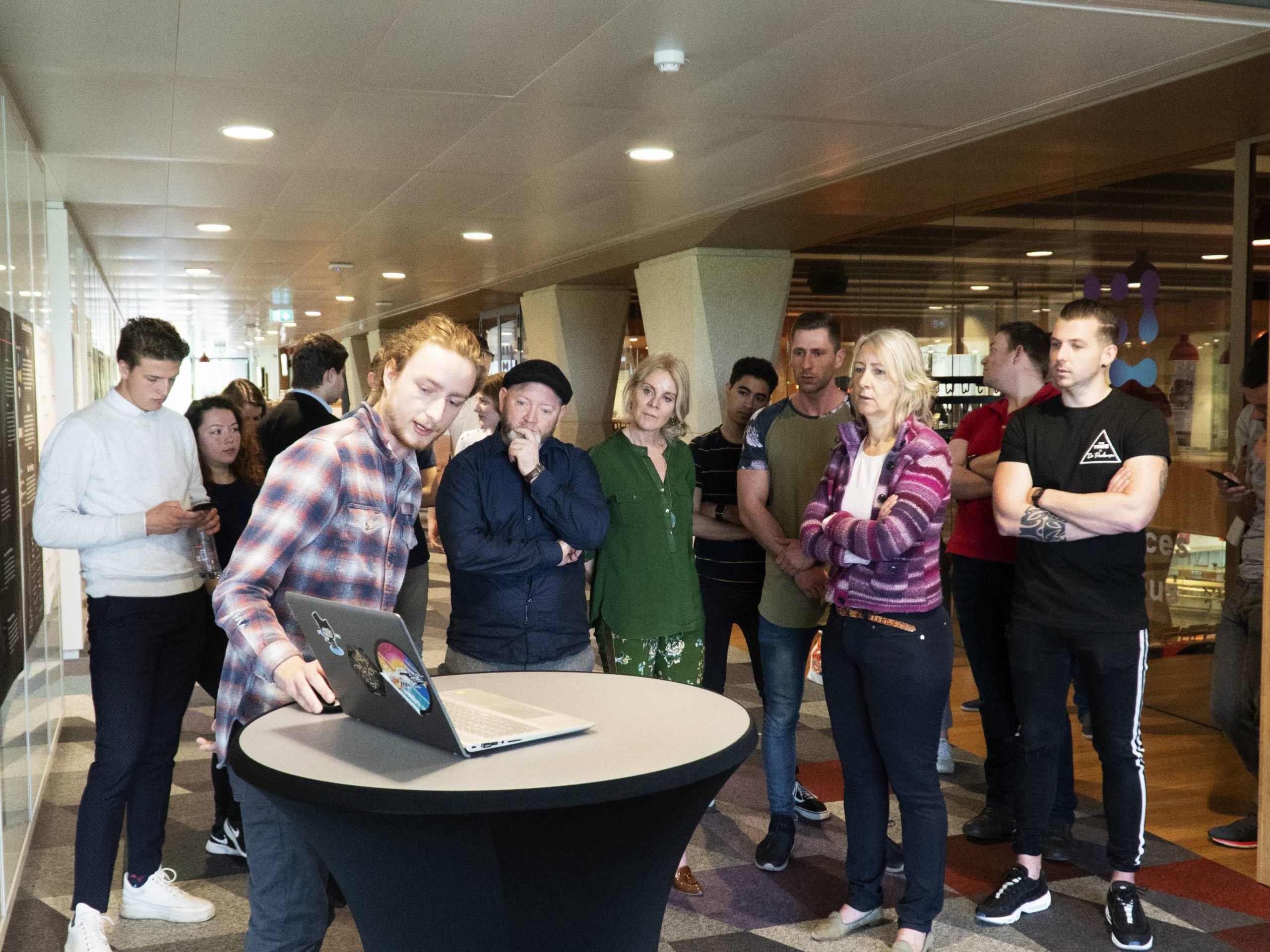
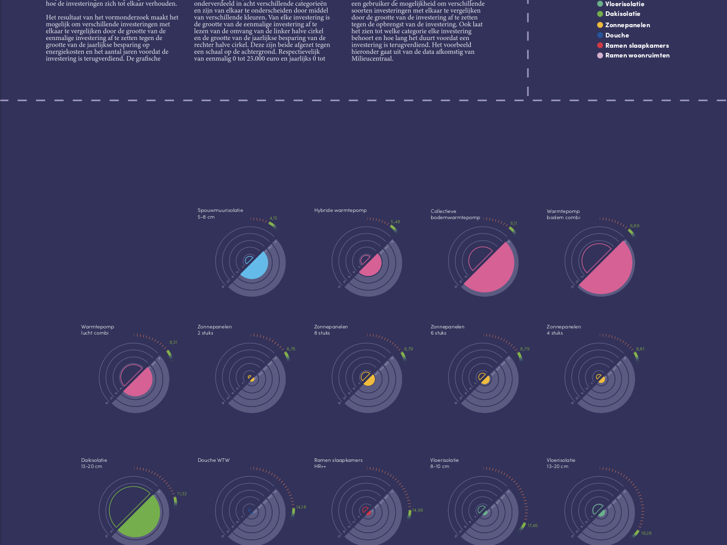
On thursday we opened our poster exhibition at the human data interaction lab.
These projects were embedded in our long term research projects. Students, lecturers from zuyd and the HDI lab team were investigating novell visualisation approaches within our new interdisciplinary datavisuallization specialization course (minor). Students from different faculties and profiles like business intelligence, software development, visual communication as well as communication and multimedia design presented their work of the last months. The result were more then 20 contributions with novel concepts. Several of them will be further developed during this year – within research as well as well as innovation projects.
Together with business partners in the field of finance and infrastructure we will use the insights to improve the way how they (visually) analyse their data. Last year we started together with students and the province of Limburg a mixed methods research approach to get a better understanding how to make open data more accessible for citizens, within this course we did several design studies how to apply this knowledge by visual means. Thanks to Andre from the human algorithm interaction group from RWTH Aachen for the guest lectures, Humberto Kelkboom for the data processing workshop, UM for supporting the course, Ellen, Erik, Vincent and all the others who supported us. All together we managed to realise more than 100 hours of workshops and lectures to make this possible.


Dutch Design Week - Mapping Sustainable Energy Production
Dutch Design Week
Mapping Sustainable Energy Production
Recognitions
Featured at CHI 2023
Featured on Dutch Design Week 22
Featured on the Dutch Kings Day
Featured on SBS 6 (dutch television)

The Project
Understanding climate change is not just about the rise of CO2 Emissions but also mitigation. To explain the underlying mechanisms, we investigate novel concepts to enhance the understanding of those. One example is the key of the future.
The key, which has a physical and a blockchain component, is composed of several cubes: each cube represents a municipality in Limburg. The size represents the amount of renewable energy per inhabitant in the present, and a small orange cube inside indicates the amount ten years ago. In this period, the share of renewable energy has grown by almost 700%, and it was initially so small that it could hardly be represented with an orange cube.
The object is thus a data-driven symbol that we should not see the world as it was, but how much more beautiful and sustainable it can become.
Related Publications
Kay Schroeder, Steffi Kohl, Jules Sinsel
CHI’23 WS 10: Dataphysicalization from Theory to practice
Hamburg 2023

Digitization in Government Institutions: Data, Ethics and Society
Data, Ethics and Society:Data-Balloons
Project partner
The Project
In a societal context, data serves to objectify and reflect content, yet its communication and interpretation inevitably produce subjective effects. In collaboration with government institutions, we are exploring both the practical and ethical dimensions of data visualization.
We recently launched a new workshop series in partnership with the Province of Limburg. Our inaugural session examined the historical development of data visualization, human factors with ethical implications, and fundamental principles that guide effective visual communication of data. Participants engaged in a data physicalization experiment, which revealed fresh perspectives on demographic information through tangible, physical representations of abstract data.


