
Immersive Storytelling
Immersive StorytellingSustainable Food Behaviour
Project partner

Innovative Collaboration for Sustainable Food Practices
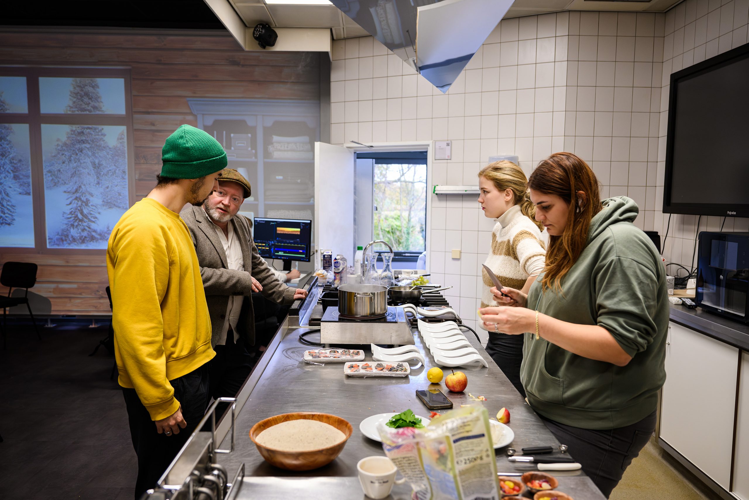
Sustainability is a pressing global issue, and innovation is key to finding solutions. Professor Kay Schröder and Professor Dai-In Danny Han, in partnership with a group of talented students, are working diligently to explore new avenues for making sustainable food behavior a part of our daily lives.
During this collaboration between Düsseldorf and Maastricht, the students are developing fresh and immersive approaches to captivate our attention and stir our consciousness and actions towards sustainable food practices. Their dedication and creativity are nothing short of inspiring.
This week, a select group of students has been hard at work in the Food Experience Lab at the Research Center Future of Food in Maastricht, weaving together the worlds of sustainability and immersive experiences. Their work is not just about theorizing but creating real-world, tangible solutions that could change the way we think about food and sustainability.
The project exemplifies how cross-disciplinary approaches—combining design thinking, food science, behavioral psychology, and immersive technologies—can create compelling experiences that not only inform but also motivate lasting behavioral change. By making sustainable choices more visible, accessible, and engaging, this initiative aims to bridge the gap between environmental awareness and everyday food decisions.


Loosing Earth - Kunsthalle Düsseldorf
Kunsthalle DüsseldorfLoosing Earth - Mapping Climate Change
Project partner
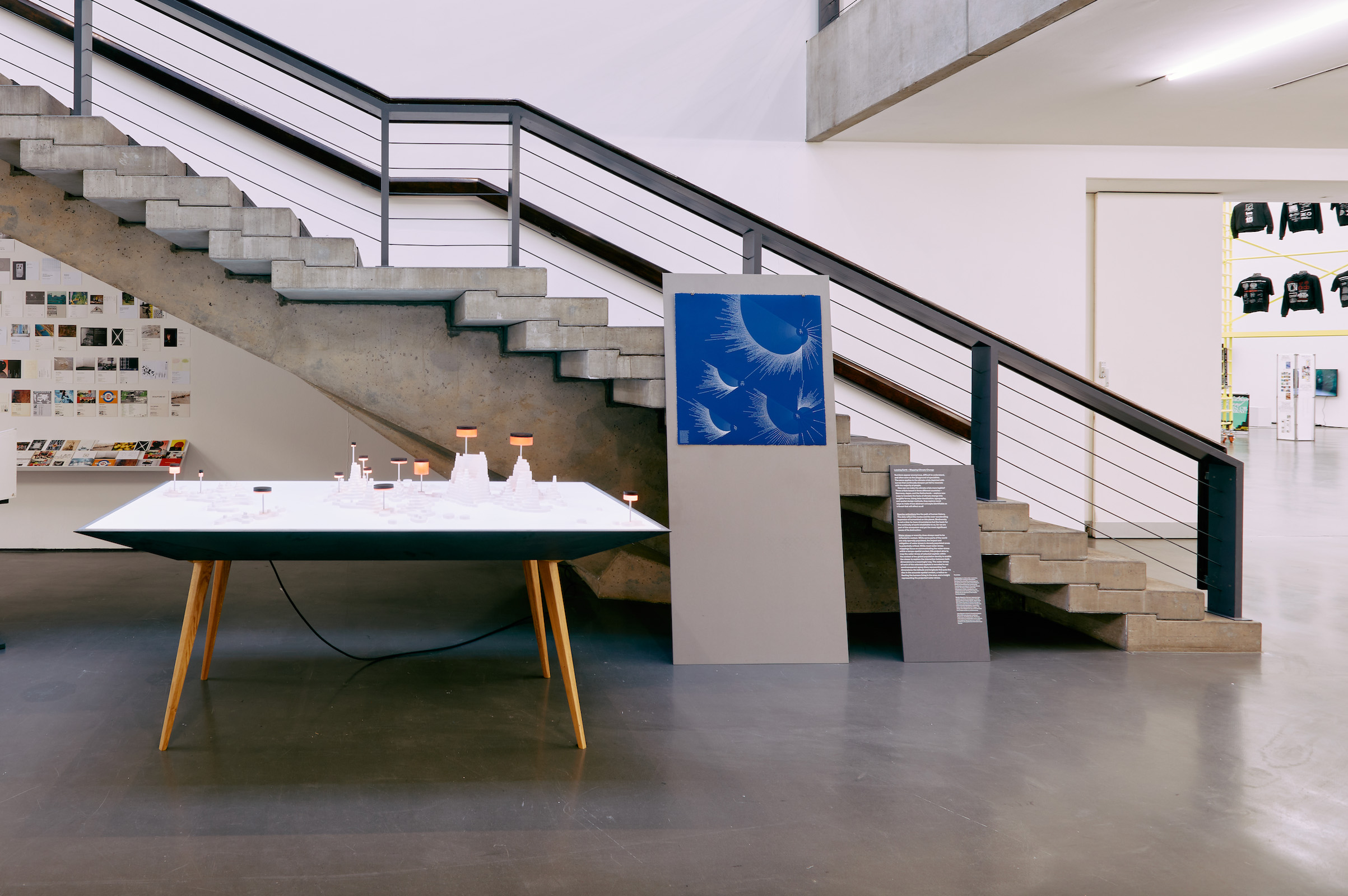
"Losing Earth" Exhibition at Kunsthalle Düsseldorf
Our exhibition "Losing Earth" was recently showcased at the prestigious Kunsthalle Düsseldorf! This innovative presentation brought together three artists based in three different countries—Germany, Japan, and the Netherlands—who explored novel approaches to translating climate change data into tangible, experiential forms.
The exhibition served as a parallel event to New Design from Düsseldorf and attracted an impressive 3,000 visitors to the Kunsthalle. At the heart of "Losing Earth" was an exploration of climate data through spatial and typographical representation, offering fresh perspectives on how we might interact with future climate scenarios.
Visitors experienced the remarkable works of data artists Kay Schröder, Mariko Takagi, and Jules Sinsel, each bringing their unique cultural and artistic perspective to the climate crisis. The international collaboration highlighted the global nature of climate challenges while demonstrating the universal language of visual communication.
It was truly inspiring to witness art's power to spark meaningful conversations and motivate change. We extend our sincere gratitude to everyone who contributed to making this exhibition a success. Climate change remains one of the most critical challenges of our era, and through artistic expression and creative data visualization, we hope to heighten awareness and cultivate a deeper understanding of the urgent need for collective action.


Dataviscamp: Bridging the Gap between Data and Humans
Dataviscamp:Bridging the Gap between Data and Humans
The Project
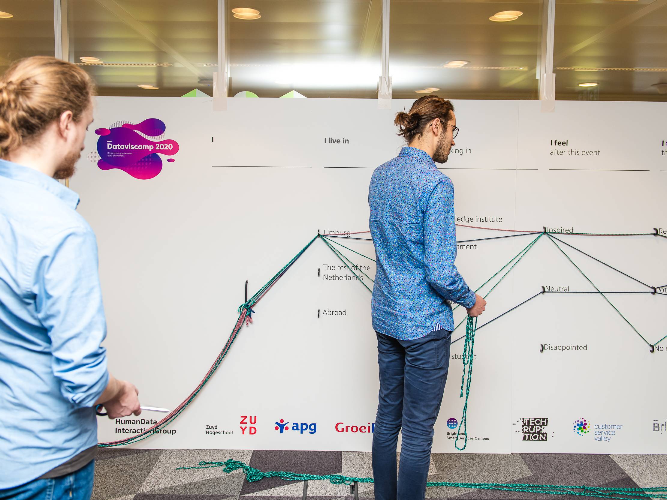
Our annual DataViscamp is over and it was a huge success.
We had more than 300 visitors, 4 workshop tracks and several surprises.
The first presentations are online now at www.dataviscamp.com


.

Inauguration on the Brightlands Smart Services Campus
My formal inauration:Professor of Datavisualization
The Project
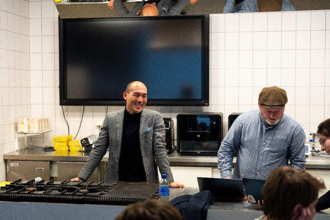
My formal inauguration was the longest day in my life (or at least one of the most thrilling ones). Thank you all for making this possible. It was mind-blowing to see so many enthusiastic people and familiar faces who have accompanied and supported me throughout the past years. I was especially touched that even my colleagues from Peter the Great University in St. Petersburg made the journey to be there.
This experience has reinforced my belief that great things happen when you work with great people. The collective energy, support, and shared vision that filled the room that day will continue to inspire my work moving forward.


.

Hololens: Visualization beyound two dimensional displays
Hololens:
Visualization beyound two dimensional displays
Project partner

The Project
Together with our partners from the finance sector, Techruption, and the campus, we have developed and evaluated several novel visualization approaches to help portfolio managers oversee assets while more efficiently considering carbon emissions. Our study systematically investigates the differences in user perception between a regular monitor and a mixed reality device.
We conducted a real-life, within-subject experiment in the field with twenty-eight investment bankers, assessing both subjective and objective task performance across two-dimensional and three-dimensional systems. The experiment tested accuracy with regard to position, size, and color using both single and combined tasks.
Interestingly, our results did not show a significant difference in accuracy between mixed-reality and standard 2D monitor visualizations. This finding has important implications for the development of financial visualization tools, suggesting that the choice between 2D and mixed reality interfaces should be driven by factors beyond mere accuracy, such as user preference, implementation costs, and specific use case requirements.


DATAVISUALIZATION: A History Of Terror in the course of time
Data Driven Storytelling:A History Of Terror in the course of time
Project partner

The Project
Global terrorism has been a prominent news topic for several decades. It's a complex issue stemming from various extremist ideologies. What headlines often fail to mention is that attacks, fatalities, and non-lethal terrorism victims have actually been decreasing since 2014. What caused this decline? How significant is the threat today, and what risks remain?
Our analysis examines the three major waves of terrorist activity recorded since the Global Terrorism Database began collecting data in 1970. We identify the groups responsible for the most attacks and document the deadliest incidents to date.
Through our interactive globe tool, users can explore terrorist attacks geographically, filter by attack types, discover the weapons used, view different time periods, and even examine specific terror groups, enabling everyone to explore the complex world of terrorism data for themselves and develop a more nuanced understanding of this global phenomenon.


.

WEARABLES: Information visualization with Instructed Reality
WEARABLES: Information visualization with Instructed Reality
Project partner

The Project
The Human Data Interaction Lab has launched an exciting research collaboration with the Dutch Police and the Open University. In partnership with ILab—an innovation department of the Dutch police—we are initiating two challenging projects to explore novel approaches to human data interaction.
We have already begun the first experiment, which involves mixed teams of domain experts, researchers, and students from Zuyd ICT. This initial project focuses on the development and scientific evaluation of instructed reality technology. This emerging field combines elements of augmented reality with guided interaction systems to enhance decision-making in complex scenarios.
The collaboration represents a significant opportunity to bridge academic research with practical law enforcement applications, potentially transforming how police officers interact with data in the field. By bringing together diverse expertise from multiple institutions, we aim to create innovative solutions that address real-world challenges in public safety and security through advanced data interaction methods.


Dutch Design Week - Mapping Sustainable Energy Production
Dutch Design Week
Mapping Sustainable Energy Production
Recognitions
Featured at CHI 2023
Featured on Dutch Design Week 22
Featured on the Dutch Kings Day
Featured on SBS 6 (dutch television)

The Project
Understanding climate change is not just about the rise of CO2 Emissions but also mitigation. To explain the underlying mechanisms, we investigate novel concepts to enhance the understanding of those. One example is the key of the future.
The key, which has a physical and a blockchain component, is composed of several cubes: each cube represents a municipality in Limburg. The size represents the amount of renewable energy per inhabitant in the present, and a small orange cube inside indicates the amount ten years ago. In this period, the share of renewable energy has grown by almost 700%, and it was initially so small that it could hardly be represented with an orange cube.
The object is thus a data-driven symbol that we should not see the world as it was, but how much more beautiful and sustainable it can become.
Related Publications
Kay Schroeder, Steffi Kohl, Jules Sinsel
CHI’23 WS 10: Dataphysicalization from Theory to practice
Hamburg 2023

Digitization in Government Institutions: Data, Ethics and Society
Data, Ethics and Society:Data-Balloons
Project partner
The Project
In a societal context, data serves to objectify and reflect content, yet its communication and interpretation inevitably produce subjective effects. In collaboration with government institutions, we are exploring both the practical and ethical dimensions of data visualization.
We recently launched a new workshop series in partnership with the Province of Limburg. Our inaugural session examined the historical development of data visualization, human factors with ethical implications, and fundamental principles that guide effective visual communication of data. Participants engaged in a data physicalization experiment, which revealed fresh perspectives on demographic information through tangible, physical representations of abstract data.


NetImmerse - Graph Exploration in Virtual Reality
NetImmerseGraph Exploration in Virtual Reality
Recognitions
Featured at Human Computer Interaction International 2022
Featured at Pleasure, Arts and Sciences Festival Maastricht
Exhibition "Touching Abstraction" Brightlands Smart Services Campus 2020

The Project
The increasing amount of interconnected data has given rise to a need among researchers and practitioners to develop new approaches to the visualization of network structures. The intricacy of such structures vastly exceeds the capacity of most conventional approaches to network visualization in terms of dimensional and resolution restrictions as they are mostly presented two-dimensional with limited screensize. An additional limition of traditional network visualization tools from a human-computer interaction standpoint is the limited interaction itself where immersion and ‘deep-diving’ into high-dimensional data is not possible. We built NetImmerse, an application to visualize network data in a virtual environment with the ability to overview, zoom, and request details on-demand. Within the virtual space, users have the possibility to either walk around the 3D data representation or rotate and move the representation using the two controllers. We tested the application with users and simulated a representative use case. NetImmerse enabled the participants to gain accurate insights based on the defined task. Participants indicated a PU of 5.25 and a PEOU of 5.46. We believe that NetImmerse is an engaging platform for multi-dimensional data exploration and may result in better insights and enhance the ability of network data exploration.
Related Publications
Kay Schroeder, Jules Sinsel
CHI’23 Workshop 4: Data as a Material for Design: Alternative Narratives, Divergent Pathways, and Future Directions, Hamburg 2023